Identity Crisis
About my personal branding: I was given advice to start on this early, forget about it, and then revisit it and see how I felt about it later on (highly recommend). It all started with my fondness with the typeface, Didot. The curves, thick and thins, and the inherent class appealed to me. I traced the two story 'g' over and over again until it did not even resemble the typeface. Then I left it alone for months.
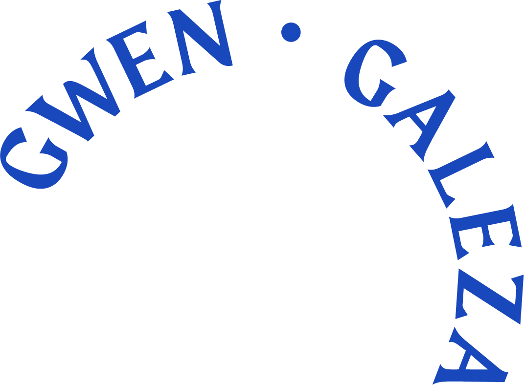
When spring semester rolled around for portfolio, I had to go back to my mark. I was stumped. I wanted to do everything: monoline, fancy lettering, and flourishes. Leslie, our design professor/mentor, did an exercise where each of the students had to describe each other in three words (below). What stood out to me was the word clean, so I went with something simple and to the point.


The color I chose for my mark was an interesting process. I had this obsession with rose gold and copper over the summer and wanted to incorporate it to my identity. When translating it from print to web the metallic sheen did not look too great. So, like a curious millennial designer, I decided to swatch my face from a selfie. The result was this pinkish skin tone (#CEA59F) from my cheeks. And that's where I learned an important lesson: Sometimes unconventional methods can result in revealing your true creativity.
